TKP + MANOEL
Visuals
24 Apr 2024

3 min read

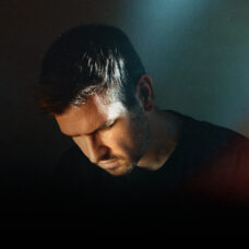
Manoel is a Brazilian independent graphic designer who combines various elements of design to achieve an elusive and complex sensory experience. His visual identity is hypnotic, minimalist, and futuristic and for this reason Manoel was the perfect collaborator to help launch TKP’s first branding project.

The world is created twice, first in the mind and then in reality.
In developing the initial stage of TKP, Manoel understood the independent artist perspective and the need to position a brand toward healthy communication and strategy for organic growth within social network platforms. Compared to other fitness competitors in the industry, TKP’s strength in uniting fitness with design allows the brand to expand creative liberties and position itself in a relevant way within the virtual environment with new ideas.

The mind, once stretched by a new idea, never regains it’s original dimensions.
Manoel and The Kilos Project collaborated on the first artistic campaign to present two of the three pillars for TKP: Recover and Create. Below are some video examples of the campaign along with a gallery containing stills for both the create and recover content. Visit the TKP Instagram to view all the clips in full.

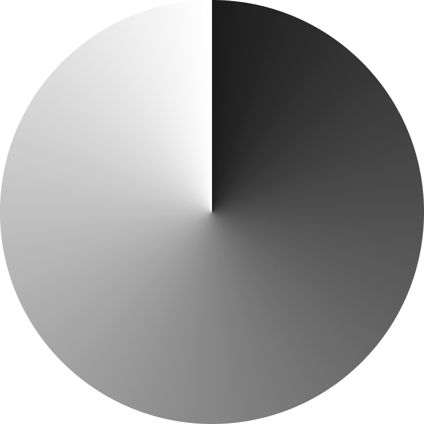
For all phrases, the following visuals were created based on concepts, elements and movements that somehow brought (even subjectively) the meaning of the message passed in each phrase. Keeping the standard of the brand’s visual identity, the predominant color palette is black/white and some variations in shades of gray. In the compositions, the elements and shapes also follow the visual id, making use of ellipses in different ways and always emphasizing both round and fluid shapes. It’s important to mention that the videos were made with infinite loops in mind, that is, when viewed in repeat mode, they don’t have a beginning or an end.
In accordance with the guidelines received, Manoel created graphs in the form of an aura as a form of inkblots, such as the ones psychologists use for Rorschach tests. The video below is the black and white version of the final result, and the color version has the combination of all three independently made ink blots which were merged together for the final piece. To differentiate each layer, Manoel used an changeable color effect that even when superimposed contrasts beautifully to the TKP’s black and white banding.
Design+Code by Analógico+Camila Lins